Prism: Website Redesign
Role: Design + Eng
2025
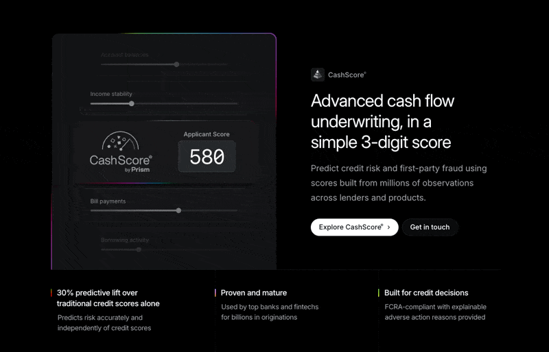
Prism Data transforms deposit data into actionable insights, powering cash flow underwriting and more.
They hired us to redesign and rebuild their website to better showcase these capabilities and strengthen their brand presence. In about three months time, they had a new site live.
Project overview
The founder of Prism brought strong ideas for elevating the brand. They were already using a rainbow gradient to connect back to the prism concept, and he drew inspiration from Pink Floyd’s iconic imagery.
From there, I took on the challenge of visualizing abstract financial concepts—like cash flow patterns and risk signals—into recognizable, intuitive visuals. Because Prism didn’t yet have a software interface of their own, I first had to dig into how the API worked and then translate that complexity into a design language people could immediately grasp.
Brand direction
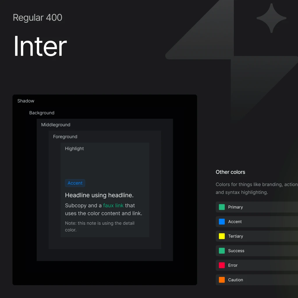
The website was the primary and most visible deliverable for this project, so the brand was essentially built right into the code.
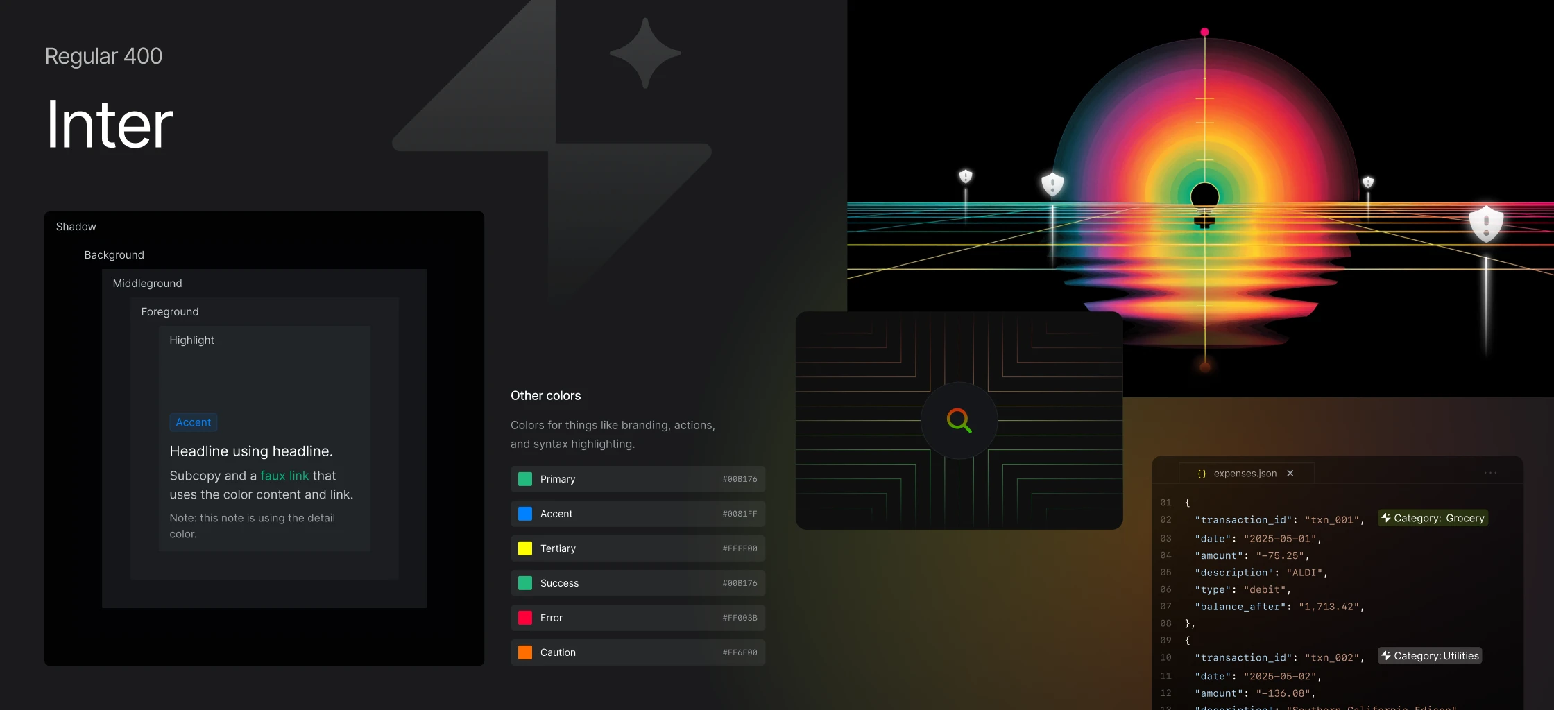
Using Mike's boilerplate, I quickly brought a refreshed identity to life—complete with light and dark modes, Inter for a clean, timeless typeface, and the use of motion and gradient to draw attention to key concepts.
From there, the system scaled naturally beyond the site, supporting Prism’s broader marketing needs with consistency and flexibility.
Scalable
The team at Prism is small but mighty, so I made intentional choices to help them grow into their new systems with ease. For blog images, I created a custom prompt paired with reference visuals, giving the team a simple way to generate consistent imagery in Midjourney on demand. I also implemented Contentful as their CMS, making it easy to manage and update content across the blog, jobs board, and legal pages.

Want to see more?
View next project